👕 T-Shirts and Data Viz
Back Story
For this year's IMG T-shirts, I wanted to implement a unique design, something that's out of the ordinary. When I went for my internship in Bangalore, I attended a workshop on Data Visualization. Our instructor, Rasagy Sharma introduced us to data visualisation and how it can be used to make sense out of chaos.
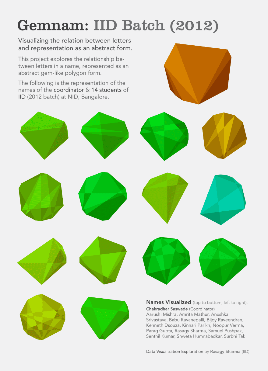
One of the projects that he showed us was Viznam. In this project, he experimented with names. For each name, he used an algorithm to map it out visually. Each name that was visualised looked similar since they originated from the same algorithm, but their exact geometry differed.
-
 One of his other works in Data visualization. You can check out his
website.
One of his other works in Data visualization. You can check out his
website.
I decided to work upon something similar. Hence for our T-Shirt design, I decided to visualise the names of each of our team members on it. In this article, I'll be sharing the experiments that I did in the process.
Who are we
IMG is a group of around 40 tech enthusiasts that manage and maintain the central campus website and the intranet portal of Indian Institute of Technology, Roorkee. We represent the technology front of the campus. We are a bunch of people filled with curiosity and an enthusiasm for building things with technology.
I wanted the result to reflect something similar. Hence, initially, I began my experimentation with diagrams that looked like a network of wires. The following section will walk you through my ideas and iterations.
Experimenting
Circular network diagrams
Initially, I experimented with circular network diagrams and bezier curves. I wanted to use a circular network as a visual representation of a network of wires.
Visual 1
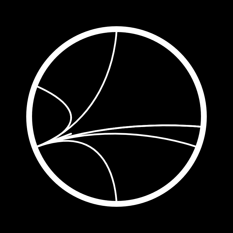
Here, the name has been represented as a network of connected points on the circle. 26 points have been placed uniformly on the circumference of the circle, with each point corresponding to an alphabet. Starting with 'a' at the top, followed by the rest in a clockwise fashion. Here are some of the examples below: Source
-
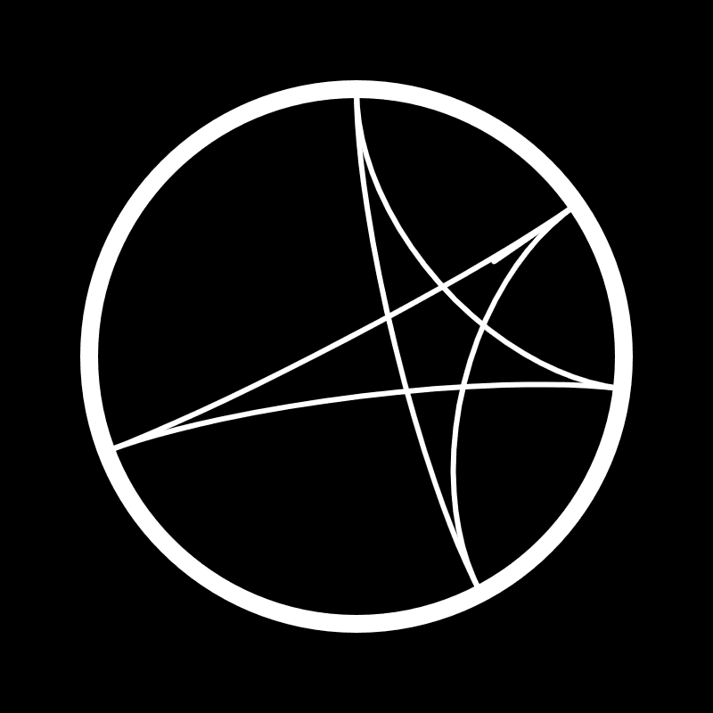 Aleesha
-
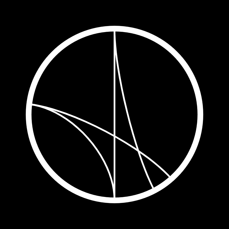 Kunal
Kunal
-
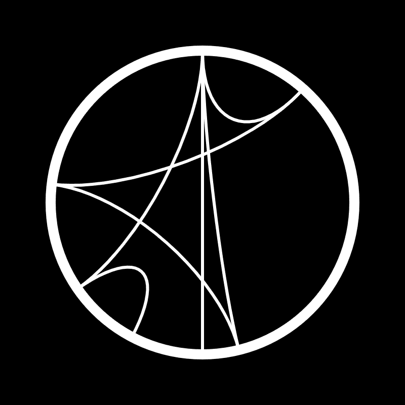 Praduman
-
 Komal
Komal
Visual 2
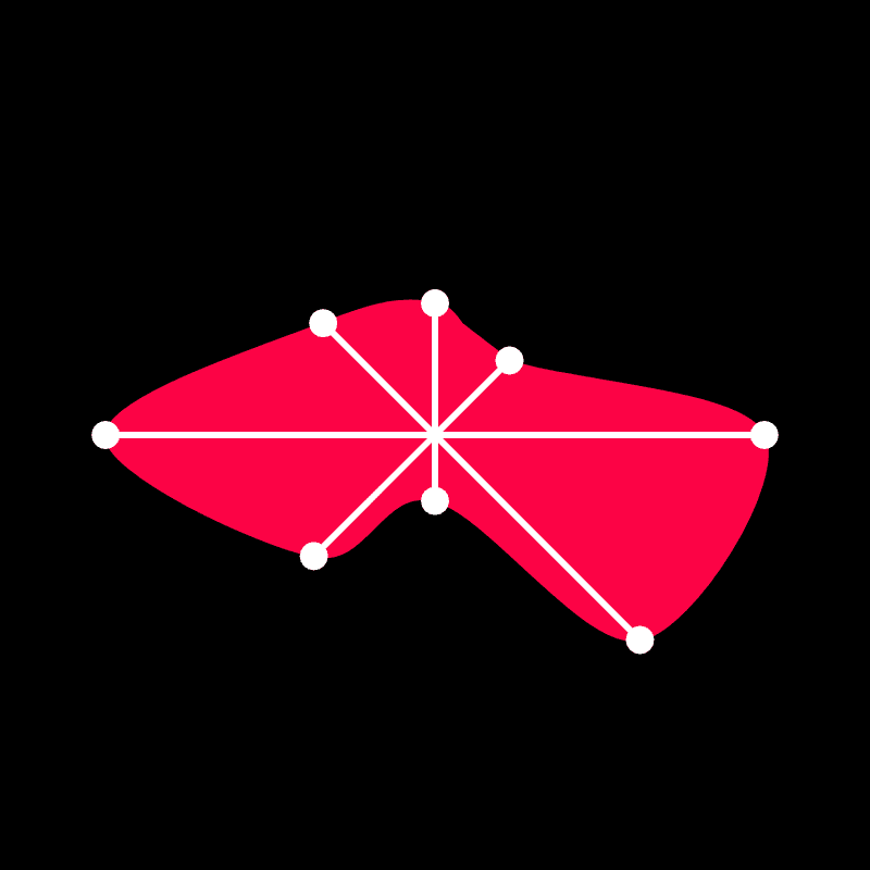
Here, all the letters of the name are connected to the first letter of the name. One drawback in such an arrangement is that you cannot figure out someone's name from the visualisation. Here are some of the examples below: Source
-
 Divyanshu
-
 Gouranshi
-
 Praduman
-
 Shivansh
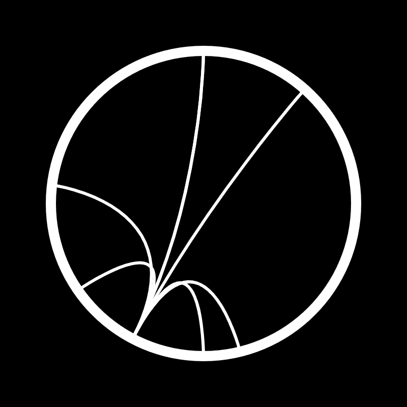
Radar Diagrams
Visual 1
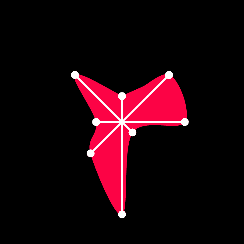
This visualization contains as many equiangular lines as the number of letters in the name. Length of each line is proportional to its distance from the alphabet "a". Joining all the endpoints of these lines gives you a polygon. Here are some examples below: Source
-
 Arpit
Arpit
-
 Gouranshi
-
 Kunal
Kunal
-
 Natansh
Visual 2
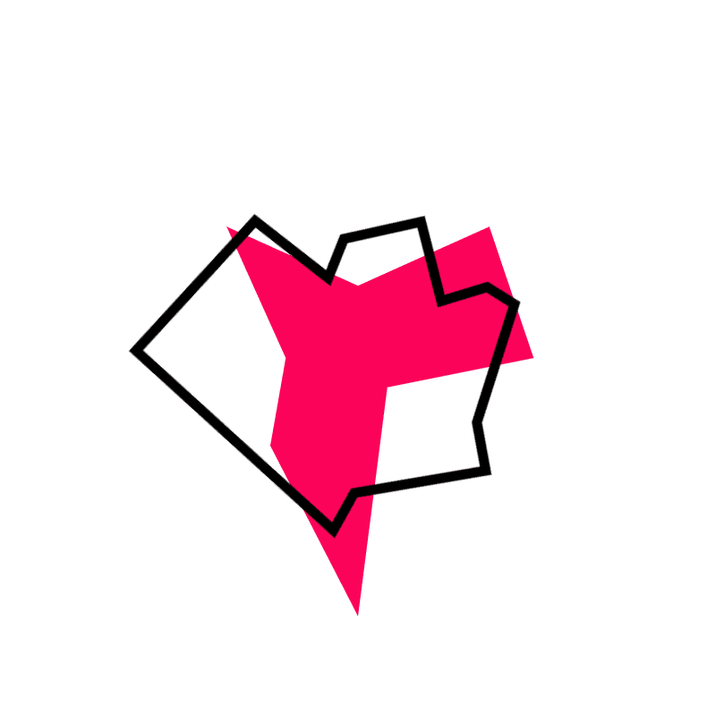
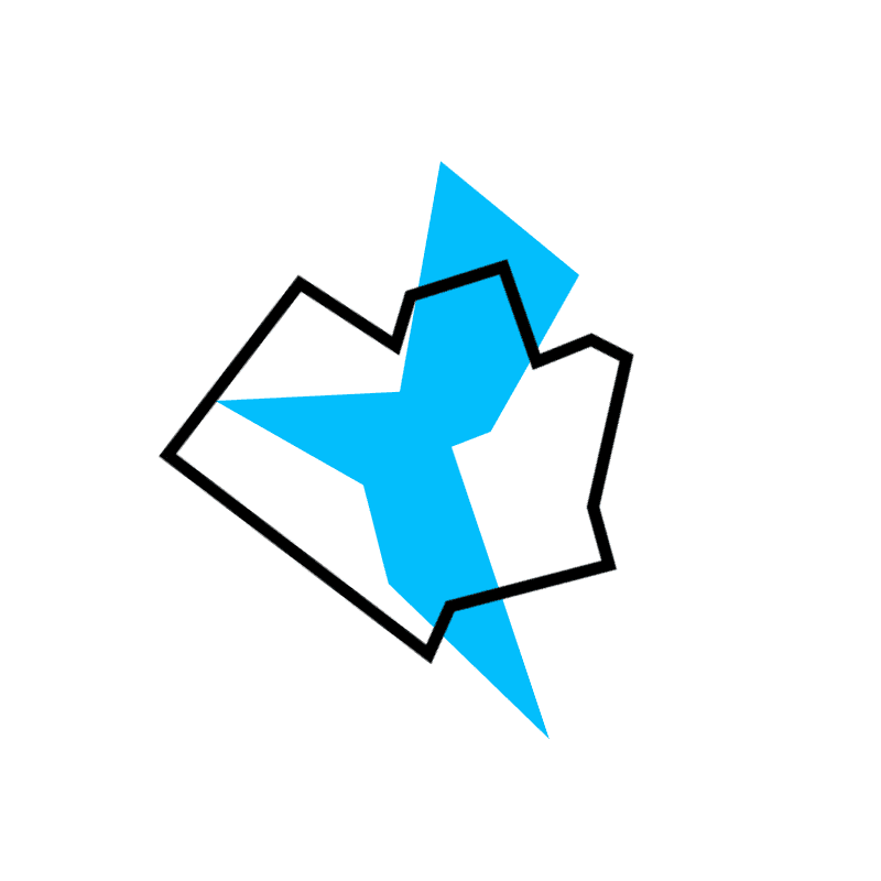
Same as before, but with a flat appearance, since it wasn't possible to print patterns that had a gradual gradation in their saturation. The black stoke represents the outer boundary of the IITR campus. Seems a childish idea to me. Here are some examples below: Source
-
 Komal
Komal
-
 Natansh
-
 Shivansh
-
 Divyanshu
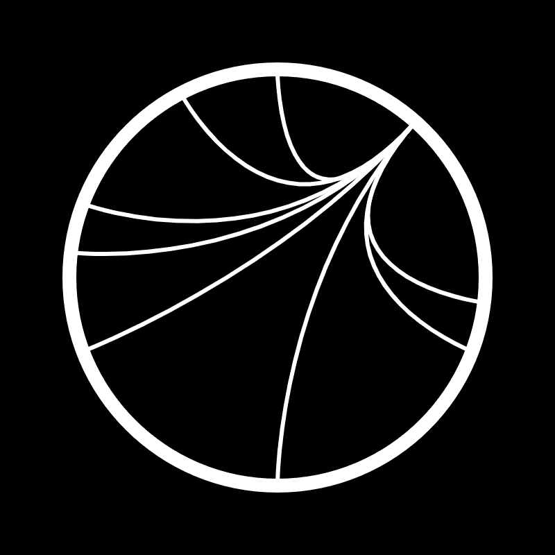
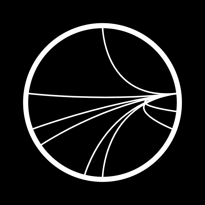
Visual 3
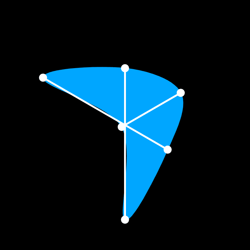
Instead of joining the endpoints of the line with straight lines, a single curved line has been used. Here are some of the examples below: Source
-
 Aleesha
-
 Mayank
-
 Gouranshi
-
 Divyanshu
Visual 4
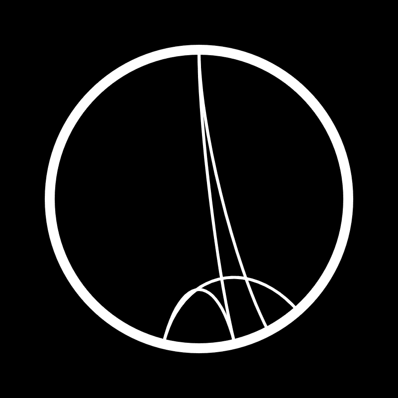
Same as before just added some lines to the visual. I find that these lines give it a more professional look. Here are some examples below: Source
-
 Shivansh
-
 Kimaya
-
 Nisarg
-
 Praduman
Result
I posted these visualisations on our group's slack workspace and asked everyone to vote for the one that they liked the most. To my surprise, almost everyone gave a thumbs-up on my first iteration. Since in it, it was possible to create complex visualisations that nearly every time looked beautiful. Plus, it was also easier to understand its relation with your name. In practice, it isn't all about what your visualisation is expressing; a lot of it also depends on factors that aren't related to aesthetics such as scalability and inclusivity in this case.
-
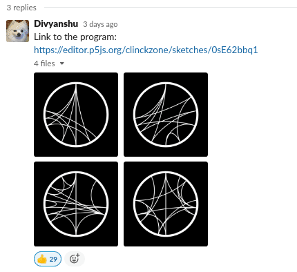 Slack Thread
Mock-ups
-
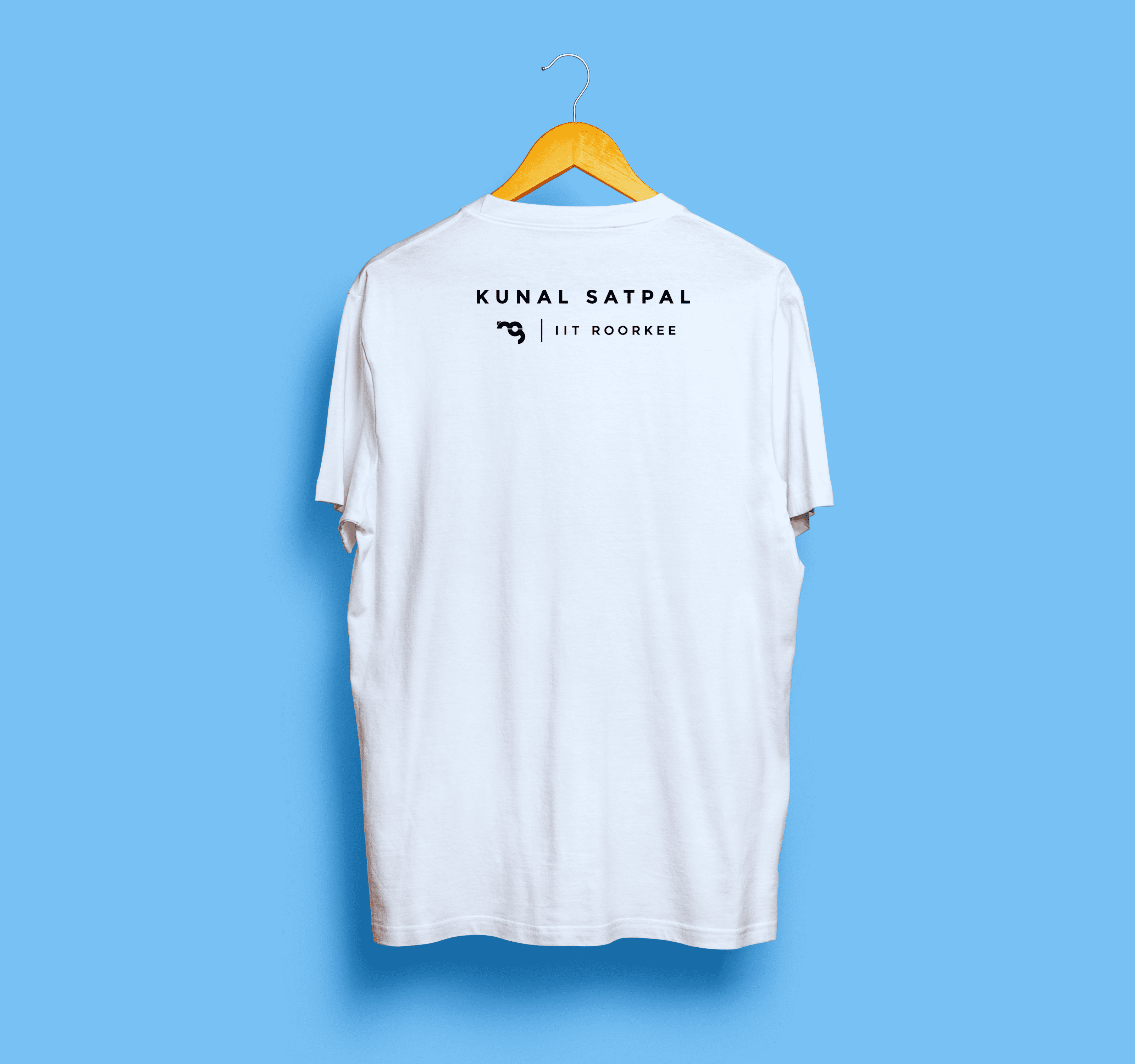 Rear
Rear
-
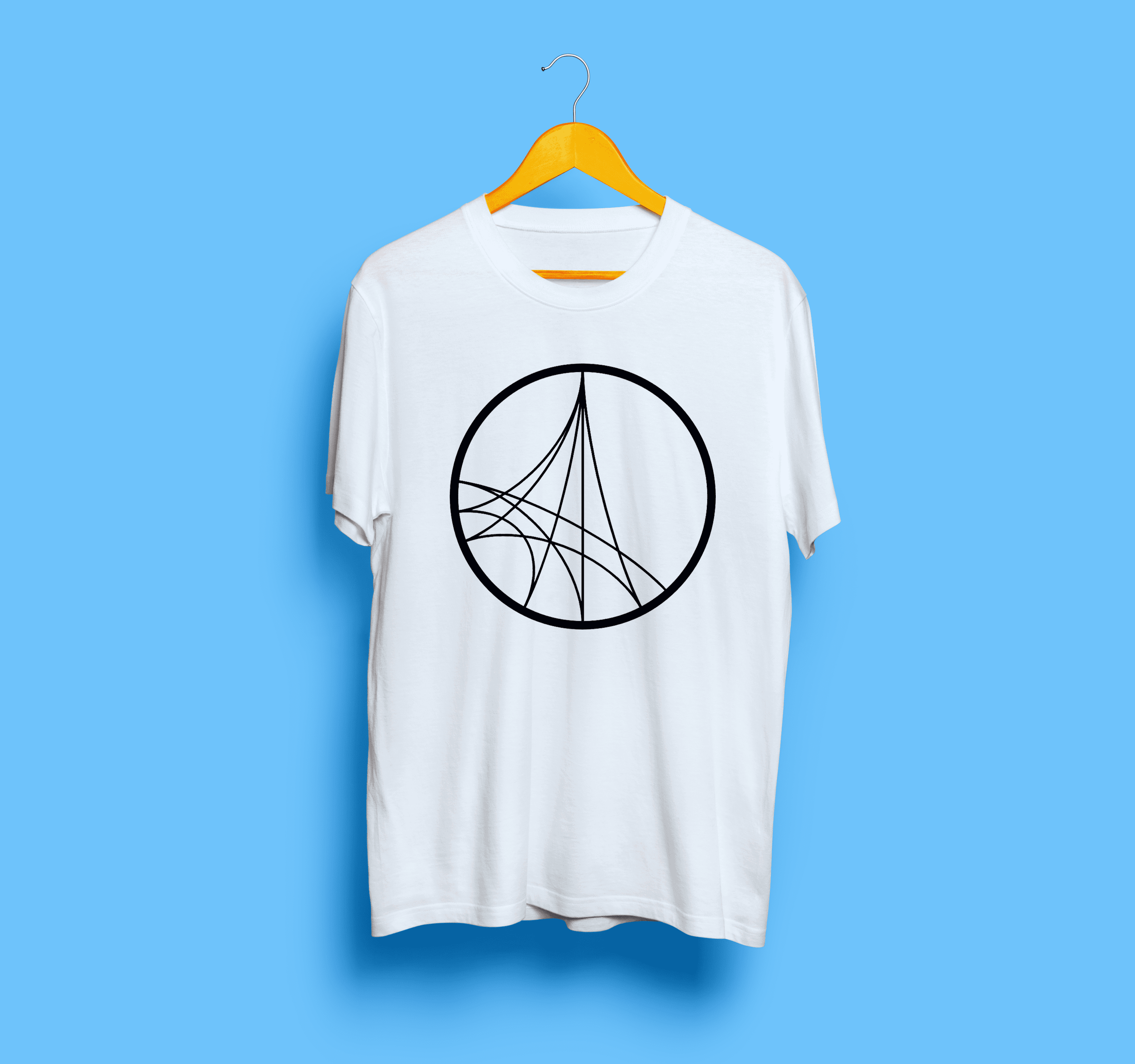 Front
Front